Search Improvements
Crisis-informed search design for people in housing emergencies
Overview
Shelter's central digital team had user-testing credits due to expire and ran a study on Shelter's main site to use them up. It surfaced clear search problems, but the team had no capacity to act on them. Because Shelter Scotland's site ran on the same platform, I picked up those findings and led the search redesign for Scotland, starting with its weakest point: the page people hit when a search returned nothing.
The brief mattered because failed searches were pushing people in housing difficulty towards the helpline when they could have found the answer online. I led the work end to end, from the research through to the changes that shipped, and it later influenced search changes across the wider Shelter network.
My Role & Impact
- Led the search redesign end to end for Shelter Scotland, from picking up dormant central research to the changes that shipped
- Built a trauma-informed research approach using proxy users, analytics and session replay, so I could learn from people in crisis without putting them through more stress
- Worked with the lead developer to phase the work, shipping quick backend wins first and the heavier UX changes second
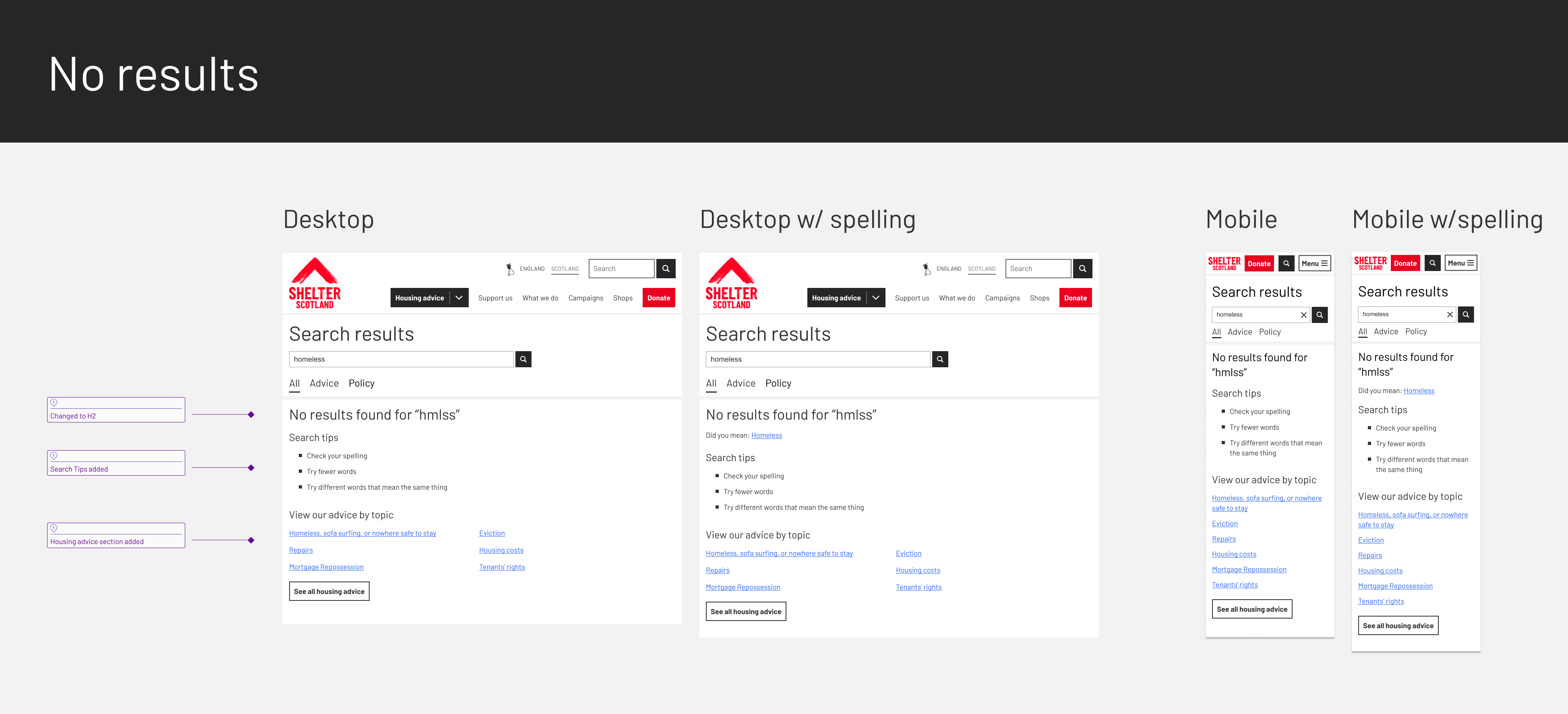
- Rebuilt the zero-results page from a dead-end into a route forward, the change the whole project grew from
- Delivered measurable improvements: search depth down 0.22 and refinements down over 3% in production analytics; in pre-launch testing, 9 of 10 participants completed tasks faster and refinements fell 25%
- Used the Scotland pilot to move a wary wider organisation, which then adopted several of the changes
The Challenge
The search wasn't built for people under stress. Users were meeting housing terms for the first time, often on a phone, often while worried about losing their home, and couldn't find the advice they needed.
Three problems ran through it: people couldn't spell terms they'd never seen before, didn't know the right words for complex legal issues, and kept landing on pages written for lawyers rather than for people seeking help.
Research and Discovery
The starting point was the central team's study. Their credits-funded research on the main Shelter site had flagged that zero-result searches were pushing people to the helpline, but nobody there could take it forward. Scotland's site ran on the same system, so the findings transferred and I picked them up.
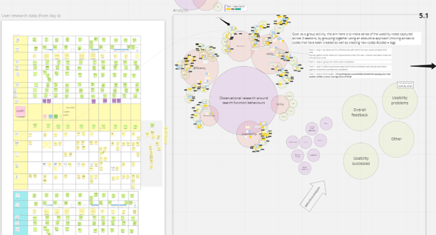
I went deeper for Scotland. Working with people in housing crisis meant a trauma-informed approach, so rather than put vulnerable users through fresh testing I used proxy users alongside analytics and session replay in Hotjar, to understand behaviour without adding to anyone's stress.
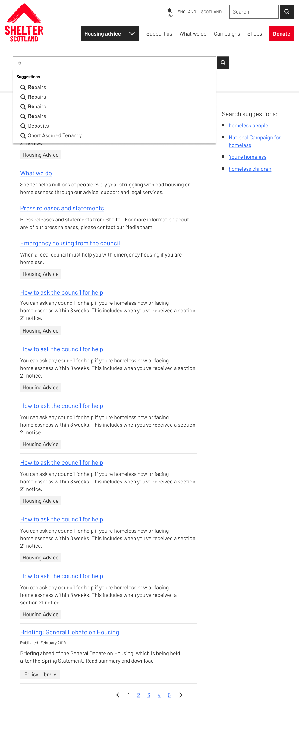
With the lead developer I analysed the misspelled-search reports to find the patterns specific to housing language. With a web content editor I worked through them to pull out the housing terms people most often got wrong, and the official form and notice numbers tied to eviction letters that people frequently mistyped.
Key Research Findings
I used affinity mapping to turn scattered search data into clear patterns. The critical finding was that people in housing crisis were tripping on terminology they were meeting for the very first time.
Key insights:
- People couldn't spell housing terms they'd never seen before
- Terminology confusion led to failed searches and helpline calls
- Mobile users saw very few results above the fold, compounding the problem
- People frequently landed on legal pages written for professionals rather than advice seekers
Problem Definition and Strategy
How do we give people in crisis search that works now, while proving the case to an organisation that was wary of changing it?
With the lead developer I set a two-phase plan. He walked me through what the backend could do, and we split the work. Phase one was the changes that needed little design time: better spelling suggestions seeded with housing synonyms, improved result ordering and backend refinements. Phase two was the heavier UX work: autocomplete, result categorisation and the mobile rebuild.
Phasing wasn't only about delivery. I knew we would have to prove value on Scotland before the wider organisation would move, so I designed the rollout as a pilot from the start.
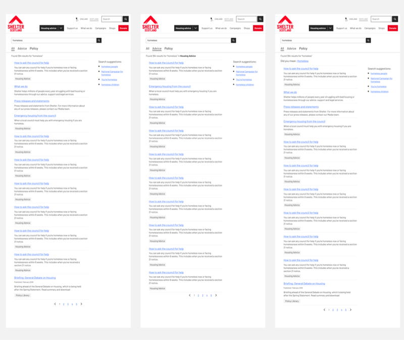
The redesign
The project grew out of the zero-results page. A failed search used to return a bare dead-end. We rebuilt it into a route forward, with spelling suggestions, search tips, topic-based navigation and direct links into the right advice, so a search that found nothing still moved someone closer to help. That page set the pattern for everything else.
From there the redesign addressed the rest of the journey, with content categorisation running through it so people could tell advice from legal information.
Crisis-specific spell check
Suggestions that understood housing terms people were meeting for the first time during an emergency.
Autocomplete
Real-time suggestions that helped people find the right words when they didn't know the correct housing terminology.
Mobile-first results
A layout that put relevant results above the fold on a phone.
Separate legal search
A dedicated path for professional legal content, kept clear of people who just needed advice.
Technical implementation
Working with the developer, the build split across backend and front end. On the backend: spelling suggestions seeded with housing synonyms, better result ordering, and the ranking refinements that improved what surfaced at the top. On the front end: autocomplete, result categorisation by content source, the separate legal search, and a mobile layout with tabbed results above the fold.
Mobile was where it mattered most. On a small phone the old layout could show a single result above the fold, sometimes only half of one, so a user often had to scroll or refine before seeing anything useful. The rebuild put at least two results above the fold, and the ranking work meant the results sitting at the top were more often the right ones. Together that turned the mobile journey from hunting into finding.
Testing Strategy and Validation
Baseline Assessment
Moderated usability testing to set a benchmark. It confirmed the core pain points: weak spell-checking, unclear terminology and poor result relevance.
Development Testing
I led the design in Figma alongside the developer through the build. For validation I used proxy users again rather than putting vulnerable people in crisis through testing, and checked changes against analytics.
Pre-Launch Validation
Final usability testing with 10 participants, 5 on mobile and 5 on desktop, showed that 9 of the 10 completed tasks more quickly and landed on the correct pages compared with the original system. Search refinements during testing tasks fell by 25%.
Launch and organisational influence
I ran Scotland as a deliberate pilot. The wider Shelter organisation was wary of changing search, so rather than argue for it centrally I shipped the full set of changes on Scotland, set the success criteria up front, and let the analytics carry the argument. Scotland's site was small enough to move quickly and close enough to the main site that the results would translate. Shipping it meant coordinating design, development and content to fit the existing architecture.
It worked as intended. After launch I took the analytics back to the central team, and they adopted several of the recommendations: search suggestions, autocomplete and result categorisation. They declined the mobile tab system and the separate legal search. The work had started from research the central team couldn't act on, and ended by changing what they shipped, which is the part I am most pleased with.
Results and Impact
In production, average search depth fell by 0.22, refinements fell by over 3% and bounce by over 1%. In pre-launch testing, 9 of the 10 participants completed tasks faster and refinements during tasks fell 25%.
The search-depth figure looks small, but for a search system it isn't. Most people only ever click the top result, so shifting the average across every search means people were finding the right page nearer the top instead of refining or giving up. Combined with the mobile fold change, that is the result I would point to first.
Helpline calls did fall over the same period. I won't claim the search work as the cause: several initiatives were running at once and the data couldn't isolate one from another. The honest read is that search contributed to a trend rather than producing a number I can stand behind.
What I'd take from this
Crisis-informed method
Designing for people under extreme stress needs a research approach that protects them while still gathering what you need. The proxy-user and session-replay approach I used here shaped how I run vulnerable-user research now.
Collaboration with engineering
Understanding the backend with the developer let me phase the work so users got value quickly. The housing-terminology work showed how domain detail can drive a technical fix.
Leading change without authority
I couldn't direct the wider organisation, so I used a pilot to prove the case and let the evidence move them. Picking the right proving ground, and setting the bar it would be judged on, did more than any amount of arguing.